In what ways does your media product use, develop or challenge forms and conventions of real media products?
Masthead
For my masthead I have used typical magazine style conventions like it being at the top of the page and a large font. I decided to stick with these ideas although I wanted to use some of my own. Although instead of keeping the my title name Up-Beat on the left hand corner of the magazine so I decided to put it centre and across the page so it makes it more noticeable and unique instead of traditional magazines. What’s more with the title design having a blue outline and a music background behind the writing. The picture background I went for was volume bars which can relate to how loud and vibrant the magazine is going to be and the word beat can communicate to the music. Also the font of the writing is simple so then it looks more professional and easy to understand for the readers, I too wanted the readers to become aware of the background image.
Design
For the design I wanted to stick to colours throughout the magazine. The colours I choose was blue, orange, black and white this then keeps it to a colour scheme which links well together with the images, font and design. These colours can also represent happy and a laid-back feel which can go well with the heading Up-Beat. Another convention I have used is the font style. I wanted to stick with the same font so it was consistent and simple for the audience.
Image
For the images I have used traditional conventions, for example, one main image, costume and make-up. In addition I have put some personnel touches to my magazine by having a plain white background with her body language positioned with her hands up in the air. This is suggesting that she is having fun and doesn’t want to be taken seriously. What’s more with the main image I have used a medium shot of a woman on her own with a white background behind her. I wanted a plain background so that all the attention focused on her because she is the new and rising star everyone should be listening to. Furthermore the costume she is wearing looks very casual and normal which shows who she is and how she wants to be portrayed. The imagery is important for a music magazine because it can relate to the social demographic and genre of my audience and how many people want to read it.
Language
The language conventions used in Up-Beat are all well established, for instance, articles, language devices and Standard English. The language I have used is easy to understand and read, I wanted this magazine to be for people who are interested in dance music, to relax or for a past time. What’s more I didn’t want to use words that some people wouldn’t understand like with the teenage or younger generation. Also the bands featured are to do with the genre and people who buy this magazine expect to see these bands with this genre.
Layout
For the layout of the front page of my magazine I have took inspiration from very original ideas like I have used banners, puffs, smaller images and the cover lines not cover the main image. I have used a banner at the bottom of the page because it looks more organised and proficient. I have also used quotes from my main star so it can give an insight to the type of person she is and what people can expect. In addition I have spaced out the main image and smaller images so that it doesn’t look over crowded.
How does your media product represent particular social groups?
For my magazine I wanted the target audience of Up-Beat to be 18-24 year olds because I feel that they can connect and have most in common with the partying lifestyle that they lead. Also this can relate to the social demographic of C-D and the majority of white males reading this magazine with 60% males and 40% females. What’s more with my front cover image her body language is quite relaxed and free which can be associated to the genre of dance. In addition the way her arms are and the way she is stood could show that she is ready to dance and fun.
What kind of media institution might distribute your media product and why?
I believe that Up-Beat would be better suited to the major institution of EMAP or Gold Key Media because I would want my magazine to reach bigger audiences and more money to spend on publishing. Furthermore with the major they seem to have more high profile and well-known contacts. On the other hand with a major institution I wanted want to lose any readers because of the over advertisement so I would make sure my magazine is controlled and kept individual to my readers needs.
Who would the audience be for your media product?
The audience for my magazine would quite a young audience of 18-24 year olds this is because they have a care-free lifestyle. They would go to shops like topshop, h&m and topman to buy their clothes because their also have young social demographic they aim for.
How did you attract/address the audience?
I attracted them with the language, free gifts and colour and design. Firstly with the language I used quite an engaging style of writing so that it was easy, simple and sociable to the readers. I had done this so it was welcoming and friendly to make them want to enjoy the magazine. Next for the free gifts I gave away three free posters from the top dance acts who are the most popular and recognisable around. Finally for the colour and design they will attract the audience’s eye because of the bright colours used.
What have you learnt about technologies from the process of constructing this product?
For the magazine I have used fireworks, Microsoft publisher and a camera for my three main technologies to construct this product. Firstly for the camera for which I took my photos was a digital camera which has a good picture quality because you could change the brightness and contrast of the photo’s you took. I firstly took the photo outside but the lighting looked too bright so you couldn’t see anything. Consequently I changed my mind and decided to do the photo inside where I could change the lighting myself. I also had to edit the photos on fireworks to give it a plain white background so there was a less focus on the setting more on the cover star.
Looking back at your preliminary task, what do you feel you have learnt in the progression from it to the full product?
Looking back at my preliminary task I have learned about the spacing, text and design. In my preliminary task I did not plan what I was going to do, for example my image, contents or text but once deciding my theme I got ideas of what I wanted to do. However I do think my full product is much better than the preliminary task because it was much more planned and organised so I knew where everything was going to be and who was going to star on it. I have also learned to space my text out and not to over-crowd it.
This is my first draft for my magazine and the front cover. I wanted to keep it simple so that the main focus was on my image.
Contents Page
This is also my first draft for the contents page of my dance magazine. I wanted the contents page to follow through from the front cover with the same type of stories and featured artists. Also i wanted to stick with the same colour scheme and have a clear and simple layout so that people can understand it and read it well. I took inspiration from Q magazine with where they place their photos on a contents page.
This is my final draft of my contents page i have added some more names to the people who work for the magazine and i have changed the mini magazine showing the front cover.
Features Page
This is the first draft of my feature page for my dance music magazine. I have used a bright background so that it stands out and looks eye-catching. Also i think you the photos look clearer when placed in front of a dark background. What's more for the feature i have used quotes, a banner, images etc so that it looks more professional and easy to understand.
This is my updated feature page for Up-Beat. I have changed the circle to a star shape for where it said "cover star" and i have added captions to the photos. Also i have made the colums smaller and thinner so that it didn't look to much to read for the audience.
This is the front cover of my music magazine, which clearly shows my target audience and social demogrpahic. It also shows the colours, artists and tagline which will feature in the magazine.
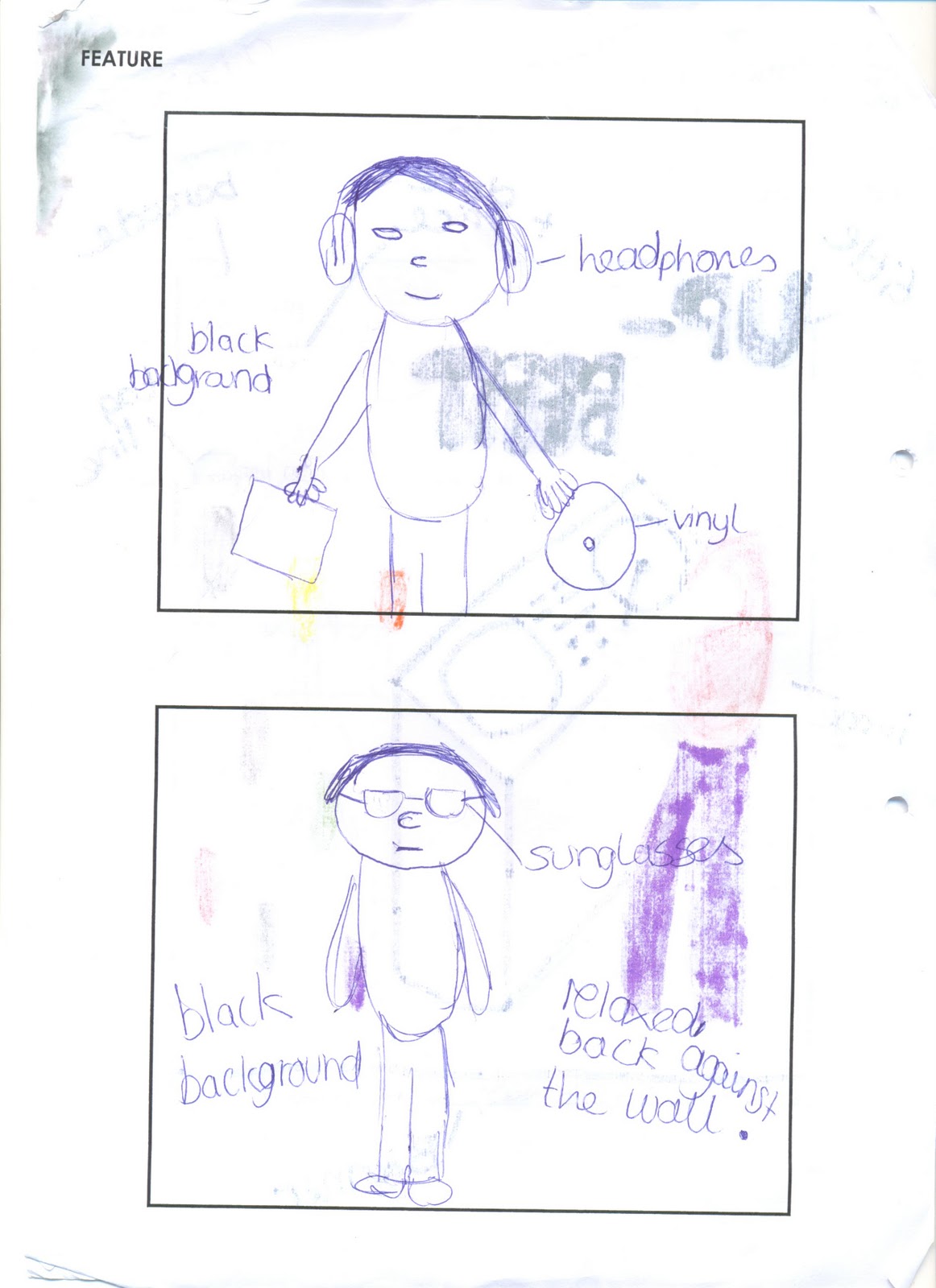
This is what some of my images will look like for my magazine and how they will be presented. Also the pictures that will be featured will be normal and not show-off so therefore the audience should like him and not feel jealous.
Firstly i had decided to go with a monkey image to edit. I then copied the picture onto fireworks and cut around it and placed it onto a clear background
To make sure my magazine was up to scratch, i looked other music magazines such as Q Magazine and Mixmag to get an idea of how good and professional they look. Also i liked both these covers because they stood out and both The Prodigy and Daft Punk are the most famous dance acts. The Mixmag gave me an idea to do my front cover image with the person having a mask on to cover their face and not have an identity. This would then make it more mysterious and premiscious for the readers and the audience. Furthermore both the magazines helped me focus more on the background image and the positioning of the artist. With Q Magazine they have positioned the frontman of the Prodigy closer to the camera. Whereas in Mixmag Daft Punk are positioned next to each other because there is no front person in the band, they are both equal.