Friday, 12 November 2010

Drafting text/page layouts

This is my first draft for my magazine and the front cover. I wanted to keep it simple so that the main focus was on my image.

Contents Page
This is also my first draft for the contents page of my dance magazine. I wanted the contents page to follow through from the front cover with the same type of stories and featured artists. Also i wanted to stick with the same colour scheme and have a clear and simple layout so that people can understand it and read it well. I took inspiration from Q magazine with where they place their photos on a contents page.


This is my final draft of my contents page i have added some more names to the people who work for the magazine and i have changed the mini magazine showing the front cover.

Features Page


This is the first draft of my feature page for my dance music magazine. I have used a bright background so that it stands out and looks eye-catching. Also i think you the photos look clearer when placed in front of a dark background. What's more for the feature i have used quotes, a banner, images etc so that it looks more professional and easy to understand.

This is my updated feature page for Up-Beat. I have changed the circle to a star shape for where it said "cover star" and i have added captions to the photos. Also i have made the colums smaller and thinner so that it didn't look to much to read for the audience.

Planning/sketching page layouts

This is the front cover of my music magazine, which clearly shows my target audience and social demogrpahic. It also shows the colours, artists and tagline which will feature in the magazine.

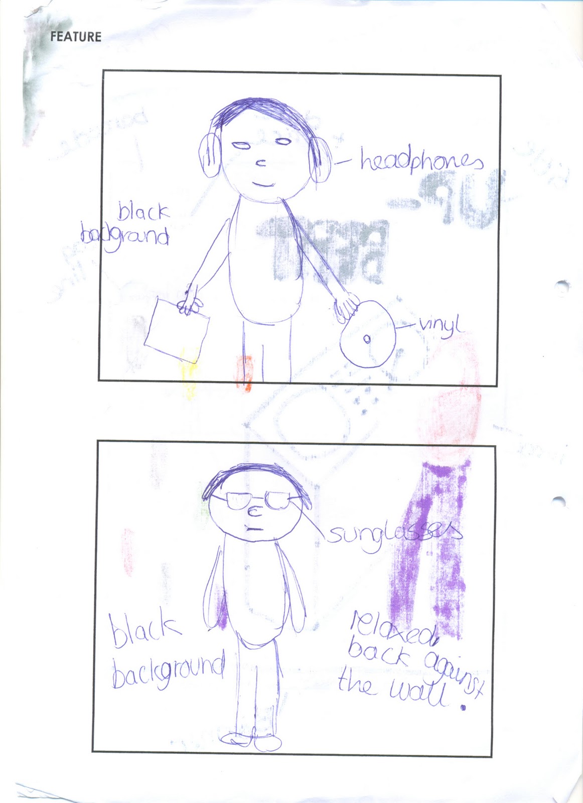
This is what some of my images will look like for my magazine and how they will be presented. Also the pictures that will be featured will be normal and not show-off so therefore the audience should like him and not feel jealous. 

Shooting/selecting images

Planning/sketching images


This is the orginal image                                                                        


Firstly i had decided to go with a monkey image to edit. I then copied the picture onto fireworks and cut around it and placed it onto a clear background
This is the edited image

Analysing front cover images

To make sure my magazine was up to scratch, i looked other music magazines such as Q Magazine and Mixmag to get an idea of how good and professional they look. Also i liked both these covers because they stood out and both The Prodigy and Daft Punk are the most famous dance acts. The Mixmag gave me an idea to do my front cover image with the person having a mask on to cover their face and not have an identity. This would then make it more mysterious and premiscious for the readers and the audience. Furthermore both the magazines helped me focus more on the background image and the positioning of the artist. With Q Magazine they have positioned the frontman of the Prodigy closer to the camera. Whereas in Mixmag Daft Punk are positioned next to each other because there is no front person in the band, they are both equal.


Researching and designing mastheads

My genre for my music magazine is dance. I have gone with this becasue i think that there is not many dance music magazines about so therefore it will be different and appeal to a lot of people. Pictured below is a spider diagram with a list of things to do with the genre.


Then i made a list of potential names for my magazine

Up-beat
Synth
The Synthezier
Electro
The Dance
Glow-sticks
Dance DJ

I then looked at some well-known brands which have it's own identity:


For example with the Nike brand it just has a logo which then people instantly recognise.


I then looked at a dance magazine called Mixmag where i had to studied it and answer questions like "what is the genre?" and "three words to summarise the magazine?".

I have choosen the name Up-beat because i really like the name and think that it goes well with the genre of dance and electro. Also i think it is catchy and stands out from the rest of the magazines.


This is the masthead i have choosen for my magazine. I have decided to go with this because i like the design and colouring. Also in the background of the word up-beat is a picture of the volume bar. Unlike other magazines which are left allined and quite small, i wanted mine to be completely opposite and have it featured at the top of the magazine and centred so it stands out more and will be recognised as the title for the magazine. Also i wanted the text to be block-style and see through with a blue outline. I have the blue outline because i think it looks vibrant and eye-catching. Next i have put the picture of the volume bar in the background of the masthead because i think that it can stand for the volume to be loud so then it will get you dancing for when you listen to this type of music. Also the word "Up-Beat" makes you think of dance/electro music because of the synthezisers and beats used in dance music.Furthermore the word "Up-Beat" makes you think of happy and fun things, which could be linked with a younger readers, they are my target audience.

Here is another masthead i have created for my dance magazine, which i also created another title and background picture. However i decided to go with my up-beat design because i think it suited the genre and design for which i was aiming for. Also it fits well with my social demographic age group and is recognisable  to my audience of the genre of music for my magazine.

Investigating the conventions of:

For this part of the blog i have studied a front page, contents and feature page to find out what makes them appealing for the audience and also labelled them to help me cover the basics for my magazine.

front covers:

With this magazine they have covered a lot of popular bands and artists on the front page, which would make it appealing to the fans and the audience. However they have not included a promotion which could helped to sell more and gain some new fans.

contents page
For a contents page it needs to follow up with the front page and have interesting and new stories. It also needs to look professional and have these key concepts featured inside.
feature page:

Likewise with the contents it needs to follow up to the front page with the stories and the bands featured.Also it needs to contain and keep with the genre of the magazine, furthermore by making it look organised and having these key concepts it can look realistic and professional.